安装
npx -y @deepseek-ai/dsh plugin --profile web add github:TecFancy/dsh-mobile此安装命令根据 GitHub 仓库地址生成,是未经验证的安装起点。
README
维护者编写的文档快照。
dsh-mobile
English | 简体中文
A mobile adapter for the DeepSeek Harness (DSH) web shell. The stock
shell is desktop-first: below 1024px the sidebar only collapses to a rail, and
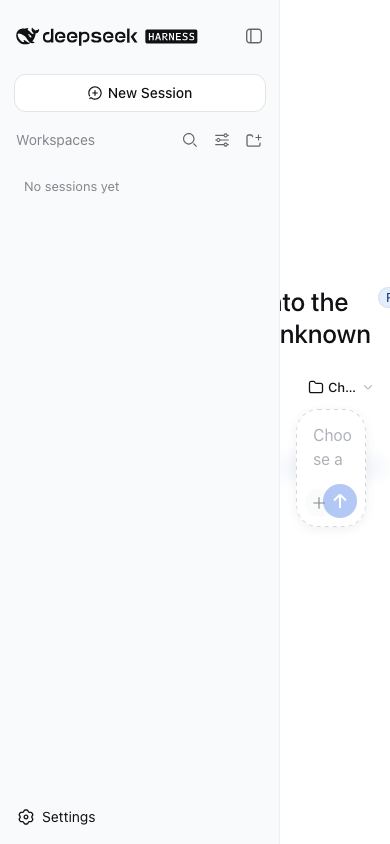
on phones the expanded drawer squeezes the main column to ~110px, composer
buttons overlap, and the settings dialog shrinks to a sliver. dsh-mobile
adds the missing phone tier (< 768px) as a client plugin — no shell fork, no
desktop changes.


Features
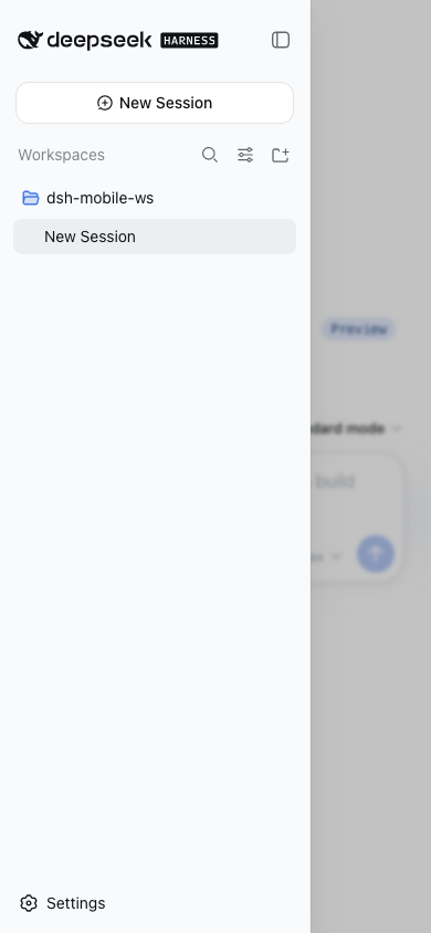
- Overlay sidebar drawer — opening the sidebar on a phone floats it over the content with a scrim instead of squeezing the main column to 110px; tapping outside closes it.
- Overlay details panel — the tool-details panel opens as a right-side overlay and never squeezes the conversation.
- Non-overlapping composer — the mode buttons and the model selector wrap onto separate rows instead of covering each other.
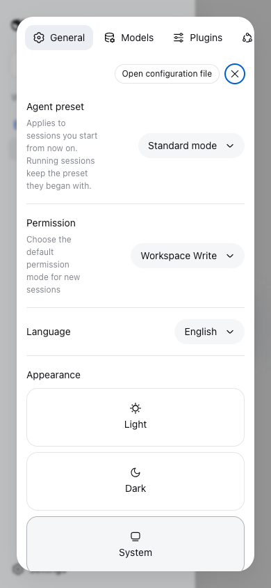
- Re-flowed settings dialog — the dialog stacks vertically with a horizontally scrollable tab bar; the content column gets full width.
- Zero desktop regression — every rule hangs under a narrow-viewport marker; viewports ≥ 1024px behave exactly like the stock shell.
Screenshots
Verified on Ubuntu 24.04 (x86_64) with DSH 0.1.0-rc.6, iPhone-15 viewport
(390×844). Screenshots show the English UI.
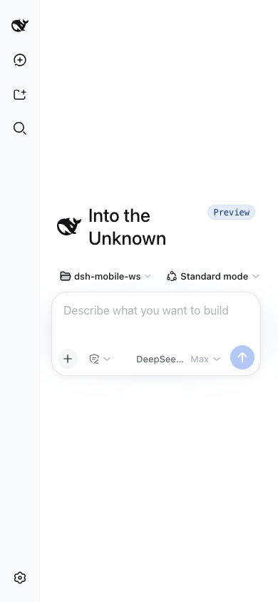
New-session screen on a phone (hero + composer with a workspace selected, laid out for the narrow viewport):
Sidebar drawer: before (stock shell) vs after
| Before — content squeezed to 110px | After — overlay drawer + scrim |
|---|---|
 |  |
Settings dialog on a phone (vertical layout, full-width content):
Desktop ≥ 1024px — untouched:
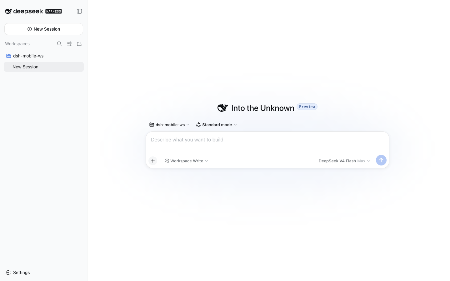
Install
Requires Node ≥ 22 and a DSH installation (dsh CLI). Install into your
profile and restart dsh web:
dsh plugin --profile web add @tecfancy/dsh-mobile
# restart: dsh web
Note: if your npm registry is a mirror (e.g.
registry.npmmirror.com), brand-new packages can lag behind the official registry for a while — add--registry=https://registry.npmjs.org/if the install reports 404.
The plugin activates automatically on narrow viewports (< 768px) and stays
inert on desktop. Removing it is one command: dsh plugin --profile web remove @tecfancy/dsh-mobile.
How it works
- A JS breakpoint layer marks narrow viewports as
body[data-dsh-mobile]. - A state bridge mirrors the shell's layout state onto
body[data-dsh-drawer]/body[data-dsh-details]. - A stylesheet (anchored on the shell's stable
[data-slot]hooks) turns the sidebar/details columns into fixed overlays on phones, re-flows the composer and the settings dialog, and never runs outside the mobile tier.
No shell source is modified, no server component is required, and the plugin
coexists with other shell-level plugins (verified with dsh-better-sidebar).
Compatibility
- DSH
0.1.0-rc.6(tested on macOS and Ubuntu 24.04; full viewport matrix: 360 / 390 / 430 / 768 / 1440). - The 768–1023px tablet range keeps the stock shell behavior (by design).
prefers-reduced-motionis honored.
License
MIT
项目文件与信号
以下项目是目录快照中检测到的公开仓库信号。
仓库信息
- 开发语言
- TypeScript
- 许可证
- MIT
- 最后更新
- 2026年8月16日 14:14
谨慎安装
请检查源代码、权限、生命周期脚本、依赖与网络访问;不受信任的插件应先在隔离环境中测试。