安装
npx -y @deepseek-ai/dsh plugin --profile web add github:yoli-mi/dsh-client-ui-custom此安装命令根据 GitHub 仓库地址生成,是未经验证的安装起点。
README
维护者编写的文档快照。
Dsh-Client-UI-Custom

中文
简介
Dsh-client-ui-custom 是一个纯前端插件,它为用户提供了浮动历史记录条、用户消息md渲染、外观调试、插件市场、快捷键和用量统计功能。
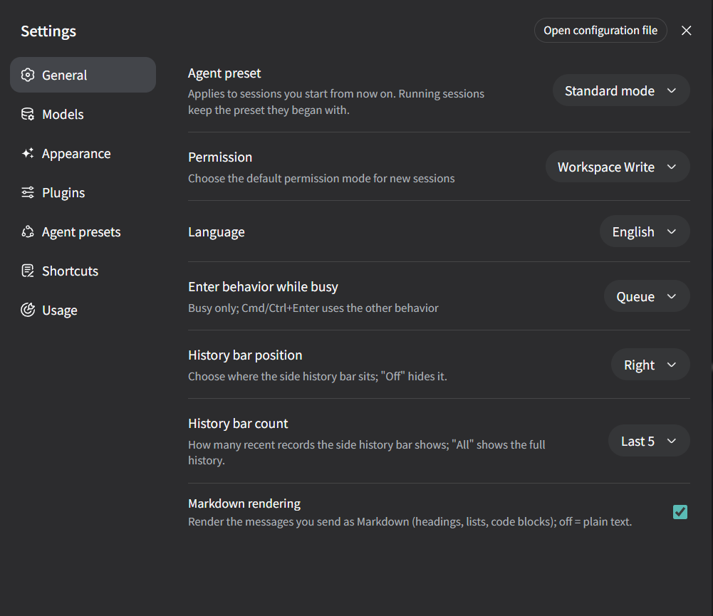
- 修改了通用设置项 —— 在「设置 → 通用」里新增了历史记录条(位置、数量)和用户消息 Markdown 渲染开关;
- 修改了插件项 —— 在「设置 → 插件」里新增了「插件市场」;
- 新增了三个设置页 —— 「外观」「快捷键」「用量统计」。
所有功能默认关闭,不配置时保持与原生界面一致,全程零 shell 改动。
宣传视频
功能选择(按需安装)
插件由六个相互独立的功能模块组成:appearance(外观)、shortcuts(快捷键)、
usage(用量统计)、history(历史记录条)、markdown(用户消息 Markdown
渲染)、marketplace(插件市场)。可在插件配置里用 features 白名单选择要安装的
功能:
- id: ui-custom
  name: '@ha-na-bi/dsh-client-ui-custom'
  config:
    features: [shortcuts, usage]   # 只安装「快捷键」+「用量统计」
features 缺省或为空时,六个功能全部启用。
设置改动一览
| 位置 | 类型 | 内容 |
|---|---|---|
| 设置 → 外观 | 新增页面 | 主题定制,包括壁纸、玻璃、强调色、表面不透明度、字体与质感 |
| 设置 → 快捷键 | 新增页面 | 自定义快捷键,包括新建对话、切换模型、思考强度等 |
| 设置 → 应用用量 | 新增页面 | 用量统计,使用四窗口聚合、趋势图,展示会话用量排行 |
| 设置 → 通用 | 修改原有页 | 新增浮动历史条(可调节位置,数量)、用户消息 Markdown 渲染开关 |
| 设置 → 插件 | 修改原有页 | 新增「插件市场」,收录第三方插件目录 |
外观(设置 → 外观)
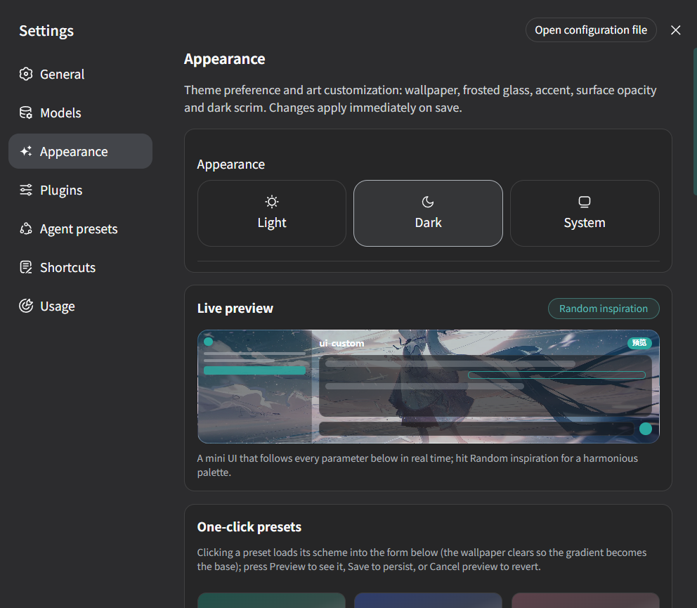
外观设置提供给用户极大的自定义空间,用户可根据自己需求选择背景、玻璃档位、强调色(可自动从
背景取色)、各表面不透明度、色调渐变、暗色遮罩、字体与字号、主题色滚动条
与内嵌晕影,并可把 ui-theme 的主题偏好(浅色 / 深色 / 跟随系统)合并进本
栏。改动通过 ui-custom settings 命名空间保存并即时生效(主题实时重渲染,
无需重启)。
预览—— 主题定制支持小窗预览。
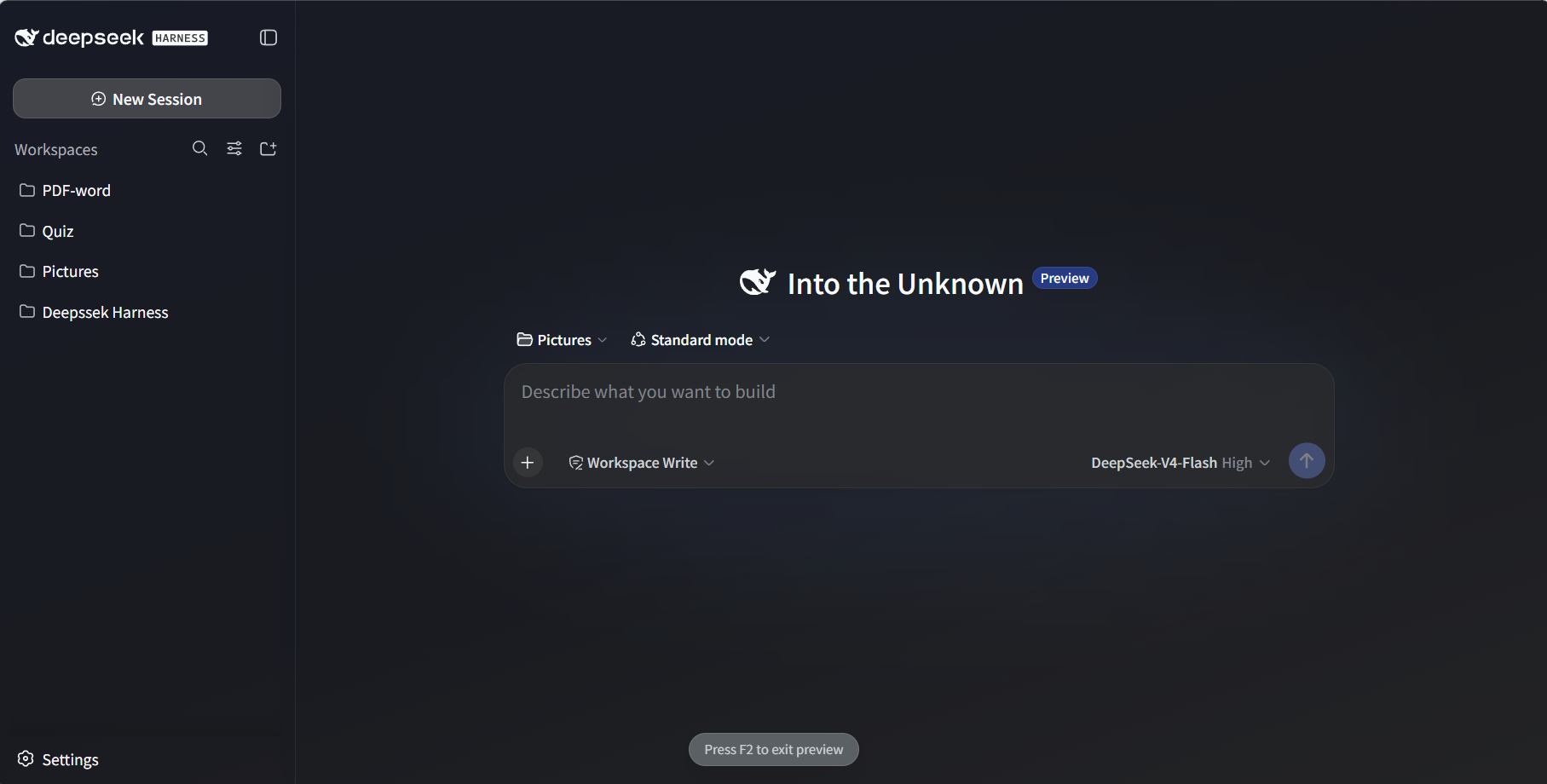
也支持全屏预览,按 F2 即可退出。
预设(Preset) —— 插件内置了六种预设,每个预设都有独立的风格(预设可独立生效,你自己的 wallpaper 仍会叠加在它之下):
| id | 名称 | 风格 |
|---|---|---|
ink-teal | Ink Teal 黛青 | 青玉色渐变,静谧沉稳 |
ink-blue | Ink Blue 黛蓝 | 黛蓝渐变,深邃克制的蓝 |
dusty-rose | Dusty Rose 藕荷 | 藕荷色渐变,温润柔和的粉 |
apricot-gold | Apricot Gold 杏金 | 杏金色渐变,温雅低调的金 |
mist-gray | Mist Gray 雾灰 | 雾灰色渐变,清冷安静的灰蓝 |
ink-violet | Ink Violet 墨紫 | 墨紫色渐变,沉静神秘 |
更多美术选择后续会扩展进这份列表 —— 见 src/client/presets.ts。
玻璃档位 —— glass 是透明度的开关;显式设置 wallpaperBlur
时总是优先于档位的默认半径:
| 档位 | 模糊 | 饱和度 | 气质 |
|---|---|---|---|
off | 0px | 1.0 | 不透明,无玻璃 |
light | 6px | 1.15 | 轻微玻璃 |
frosted | 14px | 1.25 | 强毛玻璃(默认) |
mica | 22px | 1.1 | 柔和静态质感,保留壁纸色相 |
主题配置项 —— 所有字段均可选;显式配置永远优先于预设:
| 键 | 类型 | 默认值 | 含义 |
|---|---|---|---|
preset | string | '' | 预设 id(见上表);'' = 不使用预设 |
wallpaper | string | '' | 壁纸 URL/路径(Web 可访问);空字符串 = 插件保持关闭 |
wallpaperBlur | number 0–60 | 玻璃档位默认 | #root 模糊半径(px);显式值优先于玻璃档位 |
glass | enum | frosted | off / light / frosted / mica(见玻璃档位表) |
accent | string | #4176e6 | 强调色,整套 deepseek 色阶由它派生 |
autoAccent | boolean | false | 从壁纸自动派生强调色(成功后覆盖 accent) |
surfaceOpacity | number 0–100 | 100 | 主表面不透明度(聊天/细节列) |
sidebarOpacity | number 0–100 | 100 | 侧栏不透明度 |
chatSurfaceOpacity | number 0–100 | 100 | 聊天列不透明度(经 --dsw-chat-surface) |
inputOpacity | number 0–100 | 100 | 输入框不透明度 |
codeBlockOpacity | number 0–100 | 100 | 代码块/行内代码不透明度 |
darkSurfaceOpacity | number 0–100 | surfaceOpacity | 暗色模式表面不透明度(独立档位) |
gradient | string | '' | 亮色模式下叠加在壁纸上的渐变;空 = 无 |
darkScrim | number 0–100 | 0 | 暗色模式下壁纸上的遮罩强度 |
fontFamily | string | '' | 字体栈覆盖;空 = 主题默认 |
scrollbarAccent | boolean | false | 滚动条使用强调色 |
vignette | boolean | false | 应用根节点的柔和内嵌晕影 |
customCss | string | '' | 原样追加的自定义 CSS(逃生舱) |
customVars | object | {} | 额外写到 <html> 上的 CSS 自定义属性(逃生舱) |
完整示例:
config:
  preset: 'ink-teal'
  wallpaper: 'https://example.com/wall.jpg'
  glass: 'mica'              # 或 wallpaperBlur: 8 自定义半径
  autoAccent: true           # 强调色由壁纸自动派生
  chatSurfaceOpacity: 70
  customCss: |
    .some-hashed-class { border-radius: 16px; }
  customVars:
    '--my-accent-soft': 'rgb(255 127 178 / 0.3)'
快捷键(设置 → 快捷键)
新增的设置页,提供可自定义的键位绑定。值存在 ui-custom settings
命名空间里,运行时的修改无需重启即可生效(loader 配置作为组合层 base,
「恢复默认」会回到 loader 默认值)。
| 动作 | 作用 |
|---|---|
newConversation | 新建对话(与侧栏「新建会话」按钮一致) |
switchModel | 循环切换到会话目录中的下一个模型(循环;新模型使用自身默认思考强度) |
cycleThinking | 循环切换当前模型的思考强度(off → … → max,循环) |
sendMessage | 输入框发送手势(默认 Enter) |
newline | 输入框换行手势(默认 Shift+Enter) |
usagePanel | 呼出应用用量面板(默认未绑定,可在设置中开启,如 Mod+Alt+U) |
defaultWorkspace | newConversation 打开的目标工作区(空 = 当前/最近) |
modelShortcuts | 一对一模型直达:每个组合键跳到指定模型(combo / provider / model) |

实例:
config:
  shortcuts:
    newConversation: 'Mod+Alt+N'
    switchModel: 'Mod+Alt+M'
    cycleThinking: 'Mod+Alt+T'
习惯 Enter 换行?把发送改为 Mod+Enter、换行改为 Enter 即可(两个手势
同时命中时发送优先):
config:
  shortcuts:
    sendMessage: 'Mod+Enter'
    newline: 'Enter'
模型动作走与内置模型选择器相同的 session.models / session.selectModel
RPC,输入区的模型显示会自动同步;被寻址的子代理会话会被跳过(与 UI 一致)。
不带 Mod 的组合键在输入框聚焦时不会触发,避免劫持正常打字。
用量统计(设置 → 应用用量)
用量统计页会统计展示各会话的用量总和(token-meter + session-stats),用户可自选时间跨度 (当前年内到最近三天)。页面展示 总 / 输入 / 输出 Token、 缓存命中、使用时长、会话数与步数,并带用量趋势图与会话排行。 会话列表行已携带 Host 计算好的投影基线,无需额外 RPC。
面板可通过快捷键在任何界面呼出。
通用设置项的改动
在「设置 → 通用设置」里新增内容:
浮动历史条(位置 / 数量) —— 记录某段会话的历史内容:
- 位置:
left/right/off(默认off,关闭时不显示); - 数量:显示最近多少回合(默认 10,
0= 全部); - 点击某段历史条目即可平滑滚动到对应消息,条目来自已挂载的会话快照,纯 DOM 跳转,无额外 RPC;
- 支持悬挂:在消息操作行(复制/分支之间)可选择将某段会话悬挂到历史条上, 置顶回合忽略数量限制、始终显示并带有强调色边框)。
用户消息 Markdown 渲染 —— 默认关闭;开启后你自己的消息按 Markdown
渲染(标题、列表、代码块、@子代理 / @技能 引用等),关闭时与原生
纯文本外观一致。
插件项的改动
在「设置 → 插件」里新增第三个 tab 「插件市场」,通过调用Github API 发现带有dsh-plugin topic的项目, 为用户提供第三方 DSH 插件目录。

安装
- 确保构建会包含该包(
pnpm run build:lib:client)。 - 在 Web profile 的补丁层加入浏览器 roster 行 ——
~/.dsh/profiles/web/cordis.patch.yml(或你 profile 中对应的dsh.clientroster):
- id: ui-custom
  name: '@ha-na-bi/dsh-client-ui-custom'
  config:
    preset: 'ink-teal'        # 选择预设;下面任意字段会覆盖它
    wallpaper: '/my-wall.jpg'
    wallpaperBlur: 14
- 重启
dsh web。
自行构建时需注意:设置页要能加载,ui-custom 命名空间必须在 Web 客户端的
设置暴露白名单里(packages/host/apiproxy/src/api-proxy.ts 的
WEB_SETTINGS_NAMESPACES)——本检出已加入。
工作原理
- 浏览器半区先解析
preset(presets.ts),按DEFAULTS ← 预设 ← 配置合并并对每个字段做钳制(config.ts),再把--dsu-*自定义属性写到<html>(apply.ts)。runner 会把 roster 行的config作为apply(ctx, config)的第二个参数传入。 - 样式表(custom.module.css)消费这些变量,用比主题表更高优先级的选择器
在
body/body[data-ds-dark-theme]上重新声明主题 token,插件总是 赢得级联,且不修改任何插件或 shell 源码。 - 毛玻璃给
#root加backdrop-filter,半透明表面透过它显示壁纸。 - 聊天列旋钮依赖
ConversationRoot读取var(--dsw-chat-surface, var(--dsw-alias-bg-base))—— 一行完全向后兼容 的回退写法(没有该 token 的原生 Harness 行为与之前完全一致),见packages/client/ui-conversation。 - 框架结构:
packages/client/ui-custom/
├── src/client/
│   ├── index.ts          # 插件入口:解析预设 → 规范化 → 应用
│   ├── config.ts         # CustomThemeConfig、DEFAULTS、normalizeConfig(类型收窄+钳制)
│   ├── presets.ts        # ThemePreset 注册表 —— 美术选择的扩展面
│   ├── apply.ts          # config → DOM:--dsu-* 变量、customCss、customVars
│   ├── custom.module.css # 消费 --dsu-* 变量的 token 覆盖
│   └── …                 # 其余功能子目录(appearance/ settings/ usage/ marketplace/ history/ pin/ markdown/)
├── tests/                # 配置管线单元测试
└── README.md             # 本文档(中文 / English 双语)
注意事项
- profile 的
cordis.patch.yml改动需要重启dsh web才生效。 - 壁纸必须能被浏览器访问(例如放在 Web 服务静态根目录下,或外部 URL)。
- 插件自带的设置页(外观、快捷键、用量统计等)修改实时生效、无需重启;
通过内置「插件配置」页直接编辑 loader 层配置暂不支持(待
ui-settings-plugins的 schema)。
English
Overview
Dsh-client-ui-custom is a pure front-end plugin that provides a floating history strip, user-message Markdown rendering, appearance customization, a plugin marketplace, keyboard shortcuts, and usage statistics.
- Adds to General settings — new rows under Settings → General for the floating history strip (position / count) and the user-message Markdown rendering toggle;
- Adds to Plugin settings — a new "Plugin Marketplace" under Settings → Plugins;
- Adds three new settings pages — Appearance, Shortcuts, and Usage statistics.
All features are off by default; without configuration the UI stays identical to stock, with zero shell modifications.
Feature selection (install on demand)
The plugin is composed of six independent feature modules: appearance,
shortcuts, usage (usage statistics), history (history strip), markdown
(user-message Markdown rendering), and marketplace (plugin marketplace). Use
the features whitelist in the plugin config to choose which to install:
- id: ui-custom
  name: '@ha-na-bi/dsh-client-ui-custom'
  config:
    features: [shortcuts, usage]   # install only shortcuts + usage stats
When features is absent or empty, all six features are enabled.
Settings at a glance
| Where | Kind | What |
|---|---|---|
| Settings → Appearance | new page | custom theming: wallpaper, glass, accent, surface opacity, fonts & texture |
| Settings → Shortcuts | new page | custom keybindings: new conversation, model switch, thinking effort, direct model jumps, etc. |
| Settings → App Usage | new page | usage stats: aggregated over a selectable time span, with a trend chart and session ranking |
| Settings → General | added rows | floating history strip (adjustable position / count), user-message Markdown toggle |
| Settings → Plugins | added tab | "Plugin Marketplace": third-party plugin catalog |
Appearance (Settings → Appearance)
Appearance offers a large customization space: you can choose the wallpaper,
glass level, accent color (optionally auto-derived from the wallpaper),
per-surface opacities, tone gradient, dark scrim, fonts & scale, accent
scrollbar and an inset vignette, and merge the ui-theme theme preference
(light / dark / system) into this section. Changes save through the
ui-custom settings namespace and apply immediately (the theme re-renders
live, no restart).
Preview — the theme supports a mini-window preview.
Fullscreen preview is also supported — press F2 to exit.
Presets — the plugin ships six built-in presets, each with its own distinct
style (a preset works standalone, and your own wallpaper still layers under
it):
| id | name | look |
|---|---|---|
ink-teal | Ink Teal 黛青 | jade-green gradient, quiet and steady |
ink-blue | Ink Blue 黛蓝 | deep blue gradient, restrained and profound |
dusty-rose | Dusty Rose 藕荷 | dusty-rose gradient, warm and gentle pink |
apricot-gold | Apricot Gold 杏金 | elegant, understated warm gold |
mist-gray | Mist Gray 雾灰 | cool, quiet gray-blue mist |
ink-violet | Ink Violet 墨紫 | deep violet, serene and mysterious |
More art choices will extend this list — see src/client/presets.ts.
Glass levels — glass is the translucency switch; an explicit
wallpaperBlur always overrides the level's default radius:
| Level | Blur | Saturation | Vibe |
|---|---|---|---|
off | 0px | 1.0 | opaque, no glass |
light | 6px | 1.15 | subtle glass |
frosted | 14px | 1.25 | strong frosted glass (default) |
mica | 22px | 1.1 | soft static texture, keeps the wallpaper's hues |
Theme config keys — every field is optional; explicit values always win over the preset:
| Key | Type | Default | Meaning |
|---|---|---|---|
preset | string | '' | Preset id (see the table above); '' = no preset |
wallpaper | string | '' | Wallpaper URL/path (web-reachable); empty string keeps the plugin off |
wallpaperBlur | number 0–60 | glass default | Blur radius (px) on #root; an explicit value overrides the glass level |
glass | enum | frosted | off / light / frosted / mica (see the glass-level table) |
accent | string | #4176e6 | Accent color; the whole deepseek ramp is derived from it |
autoAccent | boolean | false | Derive the accent from the wallpaper automatically (overrides accent on success) |
surfaceOpacity | number 0–100 | 100 | Main surface opacity (chat/details columns) |
sidebarOpacity | number 0–100 | 100 | Sidebar opacity |
chatSurfaceOpacity | number 0–100 | 100 | Chat column opacity (via --dsw-chat-surface) |
inputOpacity | number 0–100 | 100 | Composer input opacity |
codeBlockOpacity | number 0–100 | 100 | Code block / inline code opacity |
darkSurfaceOpacity | number 0–100 | surfaceOpacity | Dark-mode surface opacity (independent knob) |
gradient | string | '' | Light-theme gradient layered over the wallpaper; empty = none |
darkScrim | number 0–100 | 0 | Dark-theme scrim strength over the wallpaper |
fontFamily | string | '' | Font stack override; empty = theme default |
scrollbarAccent | boolean | false | Tint the scrollbar with the accent color |
vignette | boolean | false | Soft inset vignette on the app root |
customCss | string | '' | Raw custom CSS appended verbatim (escape hatch) |
customVars | object | {} | Extra CSS custom properties written onto <html> (escape hatch) |
Full example:
config:
  preset: 'ink-teal'
  wallpaper: 'https://example.com/wall.jpg'
  glass: 'mica'              # or wallpaperBlur: 8 for a custom radius
  autoAccent: true           # accent derived from the wallpaper
  chatSurfaceOpacity: 70
  customCss: |
    .some-hashed-class { border-radius: 16px; }
  customVars:
    '--my-accent-soft': 'rgb(255 127 178 / 0.3)'
Shortcuts (Settings → Shortcuts)
A new settings page with customizable keybindings. Values live in the
ui-custom settings namespace, so runtime changes apply immediately without a
restart (the loader config acts as the composition base, and Reset reverts to
the loader defaults).
| Action | What it does |
|---|---|
newConversation | Start a new conversation (same as the sidebar's New Session button) |
switchModel | Cycle to the next model in the session's catalog (wraps; the new model starts at its own default reasoning effort) |
cycleThinking | Cycle the current model's reasoning effort (off → … → max, wraps) |
sendMessage | Composer send gesture (default: Enter) |
newline | Composer newline gesture (default: Shift+Enter) |
usagePanel | Pop the app-usage panel (unbound by default — enable it in Settings, e.g. Mod+Alt+U) |
defaultWorkspace | The workspace where newConversation opens (empty = current/recent) |
modelShortcuts | One-to-one model jumps: each combo goes straight to a specific model (combo / provider / model) |
Example:
config:
  shortcuts:
    newConversation: 'Mod+Alt+N'
    switchModel: 'Mod+Alt+M'
    cycleThinking: 'Mod+Alt+T'
Used to Enter for newlines? Set send to Mod+Enter and newline to Enter
(when both gestures hit at once, send wins):
config:
  shortcuts:
    sendMessage: 'Mod+Enter'
    newline: 'Enter'
Model actions go through the same session.models / session.selectModel
RPCs as the built-in model selector, so the model shown in the composer stays
in sync; addressed subagent sessions are skipped (same as the UI). Combos
without Mod do not fire while an input is focused, so they never hijack
normal typing.
Usage statistics (Settings → App Usage)
The usage-statistics page aggregates each session's total usage (token-meter + session-stats) over a user-selectable time span, from the current year down to the last three days. It shows total / input / output tokens, cache hits, usage time, and session & step counts, together with a usage trend chart and a session ranking. The session list rows already carry the host-computed projection baseline, so no extra RPCs are needed.
The panel can be popped up from any screen via a shortcut.
General settings additions
New additions under Settings → General:
Floating history strip (position / count) — records the history of a conversation:
- Position:
left/right/off(defaultoff— hidden when off); - Count: how many recent turns to show (default 10,
0= all); - Clicking an entry smooth-scrolls to the matching message; entries come from the mounted session snapshot, so jumping is a pure DOM operation — no extra RPCs;
- Pinning is supported: from the message action row (between copy and branch) you can pin a turn onto the strip; pinned turns ignore the count limit, always show, and carry an accent-colored border.
User-message Markdown rendering — off by default; when enabled your own
messages render as Markdown (headings, lists, code blocks, @subagent /
@skill references, …); when off, they look the same as stock plain text.
Plugin settings additions
A third tab, "Plugin Marketplace", is added under Settings → Plugins: it
calls the GitHub API to discover projects tagged with the dsh-plugin topic,
providing a catalog of third-party DSH plugins.
Install
- Make sure the package is included in your build (
pnpm run build:lib:client). - Add a browser-roster row to your web profile's patch layer —
~/.dsh/profiles/web/cordis.patch.yml(or the correspondingdsh.clientroster in your profile):
- id: ui-custom
  name: '@ha-na-bi/dsh-client-ui-custom'
  config:
    preset: 'ink-teal'        # pick a preset; any field below overrides it
    wallpaper: '/my-wall.jpg'
    wallpaperBlur: 14
- Restart
dsh web.
Self-builders: for the settings pages to load, the ui-custom namespace must
be in the web client's settings exposure allowlist
(WEB_SETTINGS_NAMESPACES in packages/host/apiproxy/src/api-proxy.ts) — it
is already in this checkout.
How it works
- The browser half first resolves
preset(presets.ts), mergesDEFAULTS ← preset ← configand clamps every field (config.ts), then writes the--dsu-*custom properties onto<html>(apply.ts). The runner passes the roster row'sconfigtoapply(ctx, config)as the second argument. - The stylesheet (custom.module.css) consumes these variables and re-declares
the theme tokens on
body/body[data-ds-dark-theme]with selectors that out-specify the theme sheets, so the plugin always wins the cascade — no plugin or shell source is modified. - Frosted glass adds
backdrop-filterto#root, and translucent surfaces show the wallpaper through it. - The chat-column knob relies on
ConversationRootreadingvar(--dsw-chat-surface, var(--dsw-alias-bg-base))— a one-line, fully backwards-compatible fallback (stock Harness behavior without the token is exactly as before). Seepackages/client/ui-conversation. - Framework layout:
packages/client/ui-custom/
├── src/client/
│   ├── index.ts          # plugin entry: resolve preset → normalize → apply
│   ├── config.ts         # CustomThemeConfig, DEFAULTS, normalizeConfig (type narrowing + clamping)
│   ├── presets.ts        # ThemePreset registry — the extension surface for art choices
│   ├── apply.ts          # config → DOM: --dsu-* vars, customCss, customVars
│   ├── custom.module.css # token overrides consuming the --dsu-* vars
│   └── …                 # remaining feature subdirectories (appearance/ settings/ usage/ marketplace/ history/ pin/ markdown/)
├── tests/                # config pipeline unit tests
└── README.md             # this file (中文 / English bilingual)
Notes
- Changes to a profile's
cordis.patch.ymlonly take effect after adsh webrestart. - The wallpaper must be reachable by the browser (e.g. placed under the web server's static root, or an external URL).
- The plugin's own settings pages (Appearance, Shortcuts, App Usage, …) apply
changes immediately without a restart; editing the loader-layer config
directly through the built-in Plugin Configuration page is not supported yet
(pending the
ui-settings-pluginsschema).
项目文件与信号
以下项目是目录快照中检测到的公开仓库信号。
仓库信息
- 开发语言
- TypeScript
- 许可证
- MIT
- 最后更新
- 2026年8月17日 05:54
谨慎安装
请检查源代码、权限、生命周期脚本、依赖与网络访问;不受信任的插件应先在隔离环境中测试。